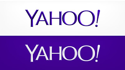
So, roughly thirty days ago, I predicted that Yahoo!'s month-long buildup to their new logo unveiling would culminate with a final design not too dissimilar from the sans serifed iteration that was kicked off in the “Day 1” slot. So how do my skills as a would-be design prognosticator stack up? I think I’ll give myself a solid "B". In essence, the final design is indeed an echo of “Day 1” (which in turn is a fairly conservative re-working of the original, belied by some of the more radical departures feigned at over the course of the last month, as I had anticipated): all caps, sans serif (with some subtle flaring and cupping), with basically the same arrangement and proportions of the respective letters. The final is decidedly more fragile-looking, with its much thinner weight, aforementioned nuances, and hints of sculpted shading, and I’m not so sure when all is said and done that “Day 1” wouldn’t have served them better. I’ve also got my doubts about the kerning: it looks alright when viewed small, as it typically appears at the upper left of their homepage, but viewed at larger sizes a rather unsettling rift between the “Y” and “A” seems to emerge. That could be addressed by the creation of slightly different versions for use at varying scales, but I think that would represent a less than ideal concession, at best, if not an outright failure of design. But at any rate, I suppose if the results are somewhat mediocre then it can be said that they were achieved by modest (but not tawdry) means: by conducting the re-brand via an in-house team, they avoided the two extremes of (outright) crowdsourcing and exorbitant payment to an (often equally mediocre) corporate i.d. leviathan.


