Friday, December 31, 2010

HCSBSB: Hezekiah's Tunnel


Well, I’ve mentioned my aversion to cutaway views before. This was actually one situation where a cutaway view would be really cool if someone could figure out how to pull it off, but I admit that I wasn’t up to it. (During my research, I actually did come across one or two attempts by other illustrators at a cutaway view, but they were not very successful in my opinion.) The difficulty is that the path of the tunnel—an engineering marvel of its day—is so circuitous that it practically defies representation in two dimensions. This would be a great project for a video-based or interactive virtual tour, and I’d love to see someone capable tackle that.

As it is, I used it as an opportunity to emphasize the growth of the city of Jerusalem from David’s time to Hezekiah’s with a dotted line representing the tunnel’s underground route beneath the Old City. This illustration appears on page 1183 of the HCSB Study Bible.

Friday, December 24, 2010

A God and Yet a Man


A god and yet a man?
   A maid and yet a mother?
Wit wonders what wit can
   Conceive this or the other.

A god and can he die?
   A dead man, can he live?
What wit can well reply?
   What reason reason give?

God, truth itself, doth teach it.
   Man’s wit sinks too far under
By reason’s power to reach it.
   Believe and leave to wonder.

—Anonymous Fifteenth Century Verse

Monday, December 20, 2010

HCSBSB: Solomon's Temple, Interior View


This interior view of Solomon’s Temple is featured, together with the exterior view featured previously, on page 706 of the HCSB Study Bible. The creative challenges posed here were the typical ones: imagining all the furnishings and the various motifs on the temple’s interior walls as they might have existed. Additionally, there were the technical challenges of rendering those same items in perspective, which becomes quite forced toward the outer edges of the picture plane, and also of conveying the desired lighting and atmosphere: a large interior space that was comparatively dark on the one hand (receiving light only from ten lamp stands and from high clerestory windows) and uniquely luminous on the other (the entire surface being covered with gold).

The walls of Solomon’s Temple were relief-sculpted with garden motifs as well as cherubim. (1Kg 6:18-29) This imagery is obviously intended to recall the Garden of Eden and the forbidden (or at least severely limited) access back into God’s presence which the temple and the high priest’s office symbolized. It was a big help to me—in fact it was virtually necessary—to work out an overall design schematically as a prelude to attempting a sketch for the three-dimensional rendering.


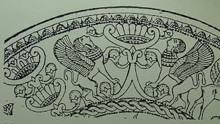
As we considered the influence of Egyptian aesthetics with the tabernacle, it seems reasonable here to assume a Phoenician influence, since we are told that Phoenician craftsmen were employed by Solomon in this enterprise. (The Phoenicians apparently borrowed from the Egyptians a good deal, so there is a high degree of continuity among some of their art forms, as the following examples attest. Cherubim and stylized “trees of life” were apparently common subjects in Phoenician art.)


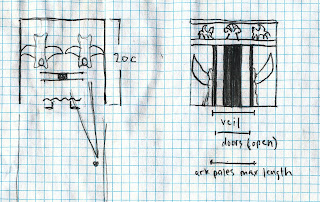
A considerable interpretive challenge was posed in the rendering of the barrier that separates the Holy Place from the Holy of Holies, which constitutes the central portion of the illustration. The difficulty arises from trying to harmonize the following textual details: There was a veil separating the two areas. (2Chr 3:14) Doors or gates are also mentioned (1Kg 6:31-35), as well as golden chains (1Kg 6:21). These details by themselves would seem to suggest a walled partition, with an entrance surrounded by doors, which when opened would reveal the veil and the chains stretched across to form an additional visual barrier. But we are also given the additional detail that the poles of the Ark of the Covenant (which rested in the center of the cube-shaped Holy of Holies, between two gigantic carved cherubim with outstretched wings) were at least partially visible from the Holy Place. (2Ch 5:7-9)

The consulting architect and I went back and forth several times trying to sort all of this out. Ultimately, the most satisfactory solution was to imagine the doors as serving a purely ceremonial function—attached to freestanding posts, without a wall on either side—with the chains stretched all the way across the barrier and with the veil covering most, but not quite all, of the remaining surface area. This configuration is at least plausible in that it “saves the phenomenon” by allowing the ends of the ark’s poles (which must have been somewhat less than 10 cubits in maximum length to allow for placement in the original tabernacle) to have been glimpsed on occasion from outside, say by a priest caring for one of the lamps at the western end of the Holy Place. (This also assumes that the ark is oriented trans-longitudinally, that is with poles running north to south, which isn’t spelled out either.) The following sketches work all of this out schematically.

Wednesday, December 8, 2010

HCSBSB: Solomon's Temple, Exterior View


Well, this next one was a pretty big deal. This exterior view of Solomon’s Temple was to appear along with an interior view and a small schematic of the same for a combined full-page illustration in the HCSB Study Bible.

Back when I began working on the Mosaic Taberncale, I started some schematics on graph paper to help me keep track of the relative sizes of all of the various features and items, and I added to it as the project progressed up through Solomon’s Temple and finally to Herod’s Temple.


Here also, is one example of several early rough sketches I produced in trying to work out the best possible vantage point:


As mentioned in these posts before, recreating many of these structures accurately from the measurements and descriptions given in the texts (biblical as well as extra-biblical) is extremely difficult, if not impossible. There are just enough gaps and just enough ambiguity in the descriptions to leave a good deal open to interpretation. Most significantly, the height of Solomon’s Temple is a matter of considerable debate. (There is perhaps a textual variance between the measurements given in Kings and those recorded in Chronicles, but it is also suggested that the temple proper and its vestibule were of differing heights and that this somehow accounts for the differing figures in a way that isn’t clear.) Most scholars stick with the more conservative figure of 60 cubits (90') for the maximum overall height and dismiss the references to a height of twice that amount as either a manuscript error or an exaggeration, symbolically motivated or otherwise. The illustrations I produced here are in keeping with this lower estimation, but I’m not at all convinced that 120 cubits (180'), as depicted here, for example, is out of the question. Indeed, I find the idea appealing on a number of levels. (Josephus, at any rate, writing in the 1st century A.D., also apparently takes the height of Solomon’s original temple to have been 120 cubits. Perhaps more on that when we get to Herod’s Temple.)

The two bronze pillars (Jachin and Boaz—they actually had names), the massive bronze “sea” on the twelve oxens’ backs and the ten “water chariots” are all point of interest and appeal. I had a lot of fun imagining them. Below is a composite of several exploratory sketches for Jachin and Boaz. There is an incredibly rich amount of symbolism bound up in each of these items, and in the temple as a whole. I would highly recommend the writings of James Jordan and Peter Leithart in this regard, and I tried to incorporate many of the insights I’ve gained from them into these illustrations. (For just one tantalizing example, check out these brief comments from Leithart on the “water chariots” and the lampstands (“burning golden trees” as he poetically refers to them).

Monday, December 6, 2010

Michael Praetorius: Mass for Christmas Morning


If you’re looking to add to your own collection of Christmas music, there’s really nothing that I could recommend more highly. A copy of this CD came into my possession several years ago through slightly odd circumstances, and I could not be more thankful: over the course of the intervening years, this recording has grown so much in my affections that I would rate it not merely as my favorite Christmas album but one of my very favorite albums, period. Just read the consistently glowing reviews on amazon.com and you’ll see that I’m not off on a tangent here. (Personally, one of the reasons I most look forward to Christmas is that I can play this recording without that tinge of self-reproach which haunts me during those moments when I can’t help sneaking in a listen here or there throughout the rest of the year.)

If I could try to pinpoint one possible reason for the strong appeal of this production, which is an attempt to recreate a Christmas Morning church service as it would have been celebrated in a large German congregation in the early 1600s, it would be its juxtaposition of the sort of tender delicacy which is more typically associated with traditional and liturgical Christmas music in our own age with a rather arrestingly wild exuberance—bombast even. This combination, which seems to be a particular gift of the Lutheran tradition, is uniquely moving in its ability to conjure up more-or-less simultaneously the sort of meditative reflection and ecstatic celebration that the Incarnation demands.

The performance captured here is reconstructed based on the work of Michael Praetorius—a towering figure in the German musical heritage, one of those giants upon whose shoulders Bach, who lived a century later, stood and upon whose foundation the latter composer was able to erect his own musical edifice, leaving a legacy that would make his a household name today. Recorded at Roskilde Cathedral in Denmark, this production wonderfully apprehends what director Paul McCreesh refers to in the liner notes as the “kaleidoscope of changing textures” envisioned by Praetorius’ arrangements and copious supplemental directions and suggestions for performance. The singers and players are divided into several groups and positioned at strategic points throughout the church, both on the ground level and high up in distant galleries, in some instances, with the robust contribution of a full congregation of singers to answer them. The solo voices shine brilliantly. The variety of period instruments—strings (plucked and bowed), reeds (including shawms and crumhorns), brass (trumpets and sackbuts), cabinet organs and harpsichords—make for a musical texture that is arresting and even charming in its lack of homogeneity, as compared with a modern orchestra. The texts, many of them based on quite ancient sources, are all in German with a good deal of Latin interspersed, a common practice in Lutheran churches of the period, but thorough translations are provided in the liner notes.

Of course, all this could easily sound like a real mess in the the wrong hands, but McCreesh does a masterful job of bringing it all together. The entire recording is captivating (even the more “mundane” sections where the priest intones the liturgy), though certain individual numbers shine with particular brilliance: the mystery-encloaked Processional Christum Wir Sollen Loben Schon (based on a 5th century Latin text, with German translation from the pen of Martin Luther himself), the dramatic Introit Puer Natus in Bethlehem, the Pulpit Hymn Quem Pastores Laudavere, and the Final Hymn Puer Nobis Nascitur. But the crowning achievement of it all is the closing Recessional, the familiar In Dulci Jubilo. I say “familiar”, though I promise you have never heard it performed like this before, and probably never will again—this side of heaven.

Tuesday, November 30, 2010

HCSBSB: Iron Age Israelite Home


I confess that, as an illustrator, I’ve never really gotten into doing cutaway views. In the right hands, they can certainly be quite engaging and done in a way that is both informative and beautiful, but I’ve also seen plenty of examples that offered the worst of both worlds, so to speak. For my part, I prefer whenever possible to stick with a more “straight up” depiction that most powerfully captures the aura of the thing and leave the other details to accompanying charts or diagrams. (That’s my aesthetic preference, but it also has to be acknowledged that the technical demands of creating a really good cutaway view will almost certainly multiply the labor involved by a significant factor as well.)

Be that as it may, I knew from the get-go that this was probably going to be one of those illustrations for the HCSB Study Bible that would indeed demand some sort of cutaway view, and so I girded up my loins and got down to it. Drawing upon my own research of domestic architecture from the region and the time period (which basically encompasses the time immediately following the Exodus and conquest of Canaan, ca. 15th century B.C, up through New Testament times), I submitted the initial sketch below.


Although I dare say that there probably existed at least one or two residences in ancient Israel that looked almost identical to my first stab (just a touch of wry sarcasm but no gall intended here), the archaeological consultant for the project suggested a more “typical” layout, and so the illustration was revised along those lines.


Friday, November 26, 2010

Rhyme of November Stars


The noiseless marching of the stars
Sweeps above me all night long;
Up the skies, over the skies
Passes the uncounted throng,
Without haste, without rest,
From the east to the west:
Vega, Deneb, white Altair
Shine like crystals in the air,
and the lonely Fomalhaut
In the dark south, paces low.
Now the timid Pleiades
Leave the shelter of the trees,
While toward the north, mounting high,
Gold Capella, like a queen,
Watches over her demesne
Stretching toward the kingly one,
Dusky, dark Aldebaran.
Betelgeuse and Rigel burn
In their wide wheel, slow to turn,
And in the sharp November frost
Bright Sirius, with his blue light
Completes the loveliness of night.


—Sara Teasdale

Wednesday, November 24, 2010

HCSBSB: David's Jerusalem


This was the earliest of several views of Jerusalem which I did for the HCSB Study Bible. I spent quite a bit of time poring over other maps and images from various periods in Jerusalem’s history. Google Earth (my favorite time-sucking software) also proved to be a very useful tool. The satellite imagery is modern day of course, but its 3D rendering capabilities are enormously helpful in providing an accurate representation of the topography, from virtually any angle imaginable! Choosing the most ideal vantage point was a big concern, especially given the fact that the city would be growing as shown in the subsequent illustrations, and we wanted to strive for consistency from one to the next, as much as possible.

Wednesday, November 17, 2010

HCSBSB: Israelite Encampment


The arrangement of the tribes of Israel encamped around the Mosaic Tabernacle in the wildernes is described in Numbers Chapter Two of the HCSB Study Bible. This is one of those Old Testament foreshadowings that is just sort of concealed within the text, but really bowls you over when you see it worked out visually. I had Jamie Soles’ song Sign of the Cross in my head pretty much the whole time I was working on this one.

Wednesday, November 10, 2010

HCSBSB: Tabernacle Furnishings


This next illustration for the HCSB Study Bible features a montage of the various items contained within the Mosaic Tabernacle: the ark of the covenant, the bronze laver, the bronze altar, the golden incense altar, the golden lampstand and the golden table of shewbread. (See Exodus 25-30; 36-40 for descriptions of their appearance and construction.) Although this illustration as a whole underwent very little transformation or development following the initial sketch (below), there was a good deal of thought and research put into each of the individual elements prior to that point.


In terms of general aesthetics, it is generally agreed among scholars that the tabernacle and its items would have been highly influenced by Egyptian art, since this would have been the only style that the Hebrews would have had exposure to for over 400 years. Furthermore, it is likely that the superintendent Bezalel and some of his fellow craftsmen would have been formally trained in the Egyptian canons and techniques. (Of course, God gave Moses very specific directions for the construction of each item, which probably went beyond the measurements and simple descriptions mentioned in the text itself to include detailed visions of the items in toto. These fully-realized visions could of course have employed any style whatsoever, whether known or unknown to the Israelites, or to any other people, prior to that time, and could have guided Moses as he in turn guided the craftsmen. Nevertheless, it seems likely that an Egyptian style prevailed, and the whole question of employing or importing a “pagan” style or aesthetic heritage into the worship of Yahweh makes for some interesting theological discussions, and has been treated by Francis Schaeffer, Gene Edward Veith, and others.)

At any rate, fabulous examples of Egyptian art from the time period abound, especially among the artifacts from the tomb of Pharaoh Tutankhamun, which include several items of similar construction to some of the tabernacle furnishings. Some items posed greater and more interesting creative challenges than others to my attempts to both faithfully and imaginatively represent them. The laver, for instance is scantily described (Ex. 30:17-21; 38:8), but it seems to have had a supporting base that was distinct from the basin itself, though the two presumably functioned and were transported as a single unit.

The ark of the covenant was of course an object of special attention. While it was tempting to make it look just like the version in the Indiana Jones movies, which I think is a splendid and probably a reasonably accurate representation, I did have a few twists of my own that I wanted to lend to my own interpretation. I worked some of these out in a larger sketch (below). First off, it seems that cherubim are presented, both biblically and extra-biblically, as winged, sphinx-like creatures, with the head of a man and the body of some four-footed animal, typically a lion or a bovine. (Parallel examples abound in the art of numerous cultures, including Egyptian, Phoenician, Assyrian, Babylonian and Greek.) The Bible speaks of the lid of the ark as the “mercy seat”, and a seat is actually what it was: the cherubim spread out their wings to serve as a throne upon which the presence of Yahweh Himself was seated. (Perhaps the cherubs’ wings surrounded or enveloped an actual throne or seat, though I did not include one.)

The question of the ark’s orientation (did the carrying poles go in the long or the short side?) is particularly consternating, as I’ll explain in more detail when discussing the sketches for the Temple of Solomon, and I’m still not settled on the answer to that one. (You can see that I actually switched the orientation even here.) The relief-sculptured motif on the ark’s front is purely my own imagining, but is an exploration of how the exodus event might have been captured in visual terms. You have the parting waters of the Red Sea, re-birthing Israel as a nation, and the two tablets of the Decalogue, overshadowed by pyramid-shaped mountains. These recall both the land of Egypt that had been left behind (pyramids are stylized, man-made mountains, after all) and Mount Sinai (with the glory of God streaming from the top), where Israel’s identity as Yahweh’s Covenant Nation was formally established.


Saturday, November 6, 2010

Helvetica


It isn’t too often that you see the labels Film and Typography juxtaposed is it? I finally got around to watching this one last night. (My wife is out of town for a few days. No way I would have gotten her to sit through this one.) I have to say it’s a really well-made and fascinating documentary—I daresay even non-graphic designers or typographers would find it interesting if they gave it a chance. (But maybe I’m just kidding myself.) Being one myself (a graphic designer, that is) I will confess that I’ve never really felt a strong attraction for this typeface, to say nothing of the adulation which it, being the ubiquitous and quintessential typographical encapsulation of the modernist movement, arouses within so many in my field. In fact, that goes a long way toward explaining why I found the film so pleasing: far from being the sort of one-dimensional encomium that I rather expected, the featured interviews with respected designers and typographers encompass the extremes of “love it” as well as “hate it”, with glimpses of the varying gradations of ambivalence which lie between. For my own part, I’ll say that in many respects my own reasons for not being in love with it were largely confirmed. (The virtual paeans offered on its behalf by the avowed disciples of modernism, lauding it as the consummately “neutral” and formless conveyor of pure and unsullied content, brought a simultaneous smile to my face and furrow to my brow. Associations with characters from C. S. Lewis’ novel That Hideous Strength kept springing to mind as I listened to some of these guys.) At the same time, and somewhat paradoxically I suppose, I have to say that my appreciation for it in some regards was enhanced. It definitely has its strong points and its place. So maybe, when all’s said and done, even as I eschew those principles which animate it, I might actually have to start using it here and there…every once in a while, at least.

Wednesday, November 3, 2010

HCSBSB: The Tabernacle


This view of the Mosaic Tabernacle was actually the first illustration I completed for the HCSB Study Bible. The inclusion of all the tents in the background, which needed to look pretty numerous and vast, presented probably at least as much of a challenge as the tabernacle and associated items and persons in the foreground did. And, as is typical, I got just as caught up in rendering the sky, clouds and smoke as I did in any other part of the illustration. (That’s actually the case with a number of these. Sometimes the clouds and swirling smoke and flames wound up being my favorite parts of some of these scenes when all was said and done, oddly enough.)


This is also one of those scenes (there wound up being several) for which I built a crude model of which I could take some reference photographs from key angles that would serve as the basis for the final drawing. I felt a pretty heavy burden for making sure the relative scales and distances for all the components were accurately represented, and this was often the easiest way to accomplish that.

Tuesday, October 26, 2010

HCSBSB: Noah's Ark


This was one of the earliest illustrations I did for the project and also one of the more straightforward. (As I post these, by the way, I'm going to proceed roughly in the order in which they appear in the HCSB Study Bible, from Genesis to Revelation, as opposed to the chronological order in which each illustration was executed. That chronology would be difficult to reconstruct anyway, since some of the simpler ones were begun and completed while some of the more involved ones were still in various stages of development.)

On the one hand, Noah’s ark just sort of is what it is: the text is pretty clear as to the dimensions involved, which leaves only minor details to guesswork and interpretation. Along those lines, there were a couple of things I wanted to try and capture which were perhaps a bit unique from any of the countless other renditions I have seen. First off, it bugs me a little bit that people almost always assume that antediluvian man was primitive and crude and that therefore the ark’s construction must have been quite unrefined and utilitarian. My own study of both history and the Bible leads me to believe that, on the contrary, ancient man possessed knowledge and (in some respects, at least) a degree of technical proficiency and innovation that eludes us still today, along with a flair for embellishment and adornment that our own utilitarian age has sadly lost sight of.


Inspired by the symbolic Scriptural links between Holy Spirit-wind-water-bird(dove) that are all in play here, I wanted to propose an ark with a prow that suggested a bird. Being a rather unconventional approach I knew that would be a hard sell to the publisher (and it was) but it was fun exploring the possibilities in the course of making the attempt.


The final still retains the swirling wave motif that I drew all the way around the upper portion. The storm clouds and gathering birds in the background are meant to dramatically anticipate what is coming.

HCSB Study Bible Illustrations


This month witnesses the publication of a project that occupied me (in fits and starts) for two full years. Back in the spring of 2008, I was approached by B&H Publishing to execute over a dozen illustrations for their planned release of the HCSB Study Bible. This represented a virtual dream job for me as an illustrator, so needless to say I accepted the offer gladly.

The process involved an enormous amount of research. (Some would call it “painstaking” I suppose, but for me it was sheer delight. The real challenge posed to me at this stage was not to get too lost and absorbed in it all!) In a few cases I resorted to building some crude scale models to help me visualize with the greatest possible accuracy. There was also consultation with a professional archeologist for a number of the pieces, sometimes involving a number of revisions. The end results two-and-a-half years later are a pile of research drawings, notes and preliminary sketches big enough to fill an entire portfolio, and a final product in which I take great satisfaction - as I trust the folks at B&H do also - and which I trust will prove a most helpful and inspiring resource for students of the Scriptures.

In celebration of the event, I will be featuring here on this blog in the coming days and weeks, for the very first time, images of the final illustrations as well as, in many cases, sketches and other glimpses of the process involved in their creation. Lord willing, I will be making new posts of this material at the approximate rate of two each week over the next several weeks, so please check back in regularly. Hope you enjoy!

Wednesday, September 29, 2010

Stoney Heights Farm


I got to revisit once again that era of late-19th-early-20th-century advertising which I so love with this logo for my good friends at Stoney Heights Farm. You can’t beat their “home grown” eggs and cheese, so check ’em out!

Monday, September 6, 2010

The Fall


To what can one compare this film, one of the most magical I've seen in quite a while? Think The Princess Bride meets Moulin Rouge meets The English Patient (at least its better aspects) and you might be halfway there. This unique and enthralling movie—filmed over four years, in twenty-eight countries and at the director’s own expense (because the concept was too crazy to attract a producer)—presents a very simple but moving story at its center, surrounded by a swirling pastiche of visual imagery: audacious costumes, butterflies that morph into islands, a mystical shaman emerges from a burning tree, endless labyrinths and mazes of Escher-esque staircases, a bus-sized wagon propelled by a small army of slaves, a priest’s grinning face and elaborate collar morph into a surrealist desert landscape. And what is more, if the director himself is to be believed, no computer generated effects were used in the film! He apparently has an uncanny gift for finding and exploiting some of the most obscure and overlooked locations for scenes which one would assume could only have been realized through digital sleight of hand, or through the construction of wildly elaborate sets that would give Ben-Hur a run for his money.

Following an opening sequence (effectively accompanied only by the haunting Allegretto from Beethoven’s Seventh Symphony) involving what we, after some puzzlement, discern to be a silent movie set where something has gone terribly wrong, the scene shifts to a Los Angeles hospital, apparently somewhere around 1920. Among the interesting cast of characters which constitute the hospital’s patients, caretakers and other employees are Roy Walker (Lee Pace), the stuntman who has apparently been paralyzed from the waist down in the accident depicted at the beginning, and Alexandria (Catinca Untaru), a young child of immigrant orchard workers, who is recovering from a broken arm. Though housed in different parts of the hospital, the two wind up meeting and, in what involves some clever twists on the classic theme, Roy plays Scheherazade to Alexandria’s Shahryar, whiling away their convalescent hours by weaving a tantalizing and epic adventure tale to her enthrallment.

It soon becomes apparent however that there is a dark ulterior motive behind his obvious gift for and enjoyment in storytelling: his desire to gain the girl’s unwitting assistance in his own suicide attempt. Alexandria, however, though teased into compliance by his strung-out fable, proves at once both too naïve and too clever for him. In a moving tribute to the power of narrative, Alexandria begins to insert herself into the story when she senses that Roy is faltering under the weight of his own despair, and, in a subsequent contest of wills, each in turn seeks to steer the plot toward alternately destructive or redemptive ends.

Some other miscellaneous tidbits and sub-themes we are treated to along the way include: Clever visual portrayals of cross-cultural and linguistic misunderstandings (Roy’s intended Native American “Indian” becomes an “Indian” from the subcontinent in Alexandria’s imagining.); A delightful exploration of the very fine line that exists between reality and imagination in the life of a child. (The scary x-ray technicians that Alexandria glimpses in the hospital’s dark corridors clearly inspire the villainous hordes of the fantasy world.); Religious symbolism, much of it specifically Christian, is interwoven here and there—some of it obvious and some of it more subtle. (Why, for instance, one might ask, is a worker shown cutting palm branches from high up in a tree during the initial shot of the hospital?)

For all the delightful excesses lavished upon the film, director Tarsem nonetheless shows remarkable gifts of restraint in this production just where it matters most. Most notably, the decision to keep the running time at just under two hours keeps the magic from souring into a tedious and self-indulgent sensory overload (à la Peter Jackson’s King Kong). And while there is a curse word or two and perhaps just enough violence and brutality to justify the R rating (though I’m sure I’ve seen worse in PG-13 films), there is none of the uber-bizarre, sexualized violence which (apparently—I haven’t seen it) marks his other film of note, The Cell. Lee Pace gives a really great performance, but Untaru’s performance is just splendid, thanks in large part to careful handling by both Tarsem and Pace. (This is illuminated, along with many other fascinating details, in the DVD Commentaries and Special Features, which are also well-worth watching.)

And finally, it has to be observed that the film’s difficulties in finding a distributor (it premiered in 2006 but wasn’t officially released until 2008) just testify once again to the debased cinematic establishment’s commitment to bland, mass-marketability over genuine creative merit. (Brings back to mind Kenneth Branaugh’s still yet-to-be-released The Magic Flute.)

Wednesday, September 1, 2010

The Chicago Manual of Style, 16th (and 1st) Editions


The Sixteenth Edition of The Chicago Manual of Style—an indispensable tool for anyone involved in publishing—went on sale this week, available in print as well as by online subscription. To celebrate this newest edition, the publisher is also offering a FREE digital download of the original 1906 edition. Of special interest to designers and typophiles such as myself is the Specimens of Type in Use section at the very end, which offers a delightful compendium of turn-of-the-twentieth-century typefaces and ornaments.

Wednesday, August 25, 2010

Jonathan-Rogers.com


My friend and some-time collaborator Jonathan Rogers has recently started his own blog (in addition to his frequent contributions over at The Rabbit Room) which I heartily commend to you. Delightful posts on the importance and power of stories, insightful commentary on the arts, smile-inducing anecdotes, character sketches of some of the real-life inspirations for the Feechie-folk who inhabit his novels, and more. Check it out!

Monday, August 23, 2010

Catullus Postcard No. 1


As promised in my earlier, more detailed post, here is an online view of the final postcard art.

Tuesday, August 10, 2010

Vivamus, mea Lesbia . . .


So, I’ve had this idea for a while now to do a series of pieces (partly for my own pleasure and partly to use for self-promotional purposes) inspired by the poetry of Catullus (ca. 84-54 B.C.). His lyrical verses explore a number of very interesting themes and subjects and provide a rich source of inspiration for visual interpretation. It being summer—and an uncommonly hot one at that—what could be more fitting than to turn to one of the most famous of his mildly erotic love poems to get things kicked off? With that in mind, I chose Number Five in his catalog of over one hundred surviving poems (Number Seven is also closely related). A variety of potential approaches came to mind for the piece—abstract or semi-abstract, typographically driven, a photographically-based design, etc.—but for this one I chose to stick with a more-or-less straightforward illustration executed in pen, watercolor and colored pencil, leaving some of those other angles for possible exploration in future installments of the series. The above detail from the pencil sketch serves as a bit of a teaser; I’ll post an image of the final in a few days, after the lucky few have had a chance to get their hard copy (in the form of a 5"x7" postcard) in the mail.

Just a little background: Most of what we know about Gaius Valerius Catullus comes directly from his poetry, which descends to us from antiquity by the thinnest of threads: a single manuscript of his surviving verses came to light in his hometown of Verona sometime during the 14th century. Other biographical details have been filled in by scholars with help from references and circumstantial evidence gleaned form other sources. He was a provincial, though well-off, small-town boy from northern Italy, his family’s villa being situated in the village of Sirmio (near Verona), on a lovely peninsula at the southern end of the stunningly beautiful Lake Garda. His father was apparently a friend of Julius Caesar. Sometime during young adulthood he moved to Rome where he became completely entranced by (and intimately involved with) a highly sophisticated, married woman whom most scholars identify as one Clodia Metelli, to whom he gave the pseudonym “Lesbia” in his poems.

That much suffices as a background for the poem under consideration here, so with that we shall leave Catullus there in the arms of his Lesbia until the next installment bids us follow his course further. The original Latin text below is followed by my own translation, which is fairly literal while preserving the 11 syllables per line of the original hendecasyllabic meter.

Vivamus, mea Lesbia, atque amemus,

Rumoresque senum severiorum

Omnes unius aestimemus assis!

Soles occidere et redire possunt:

Nobis cum semel occidit brevis lux,

Nox est perpetua una dormienda.

Da mi basia mille, deinde centum,

Dein mille altera, dein secunda centum,

Deinde usque altera mille, deinde centum.

Dein, cum milia multa fecerimus,

Conturbabimus illa, ne sciamus,

Aut ne quis malus invidere possit,

Cum tantum sciat esse basiorum.

Let us live, my Lesbia, and let us love,
And all the rumors of those stodgy old men
Let us reckon as but a mere penny’s worth.
Suns may well set only to rise once again,
But for us, when our brief light is extinguished,
There is but one eternal night to be slept.
Give me a thousand kisses; then a hundred.
Then another thousand; and a hundred more.
Again, a thousand, and again, a hundred.
Then, when we have tallied many a thousand,
We’ll throw the abacus into confusion,
Lest some envious evil eye should jinx us,
If the profuse number of kisses be known.


Wednesday, July 28, 2010

Father Bach


On this date 260 years ago, Johann Sebastian Bach, aged 65 years, blind and relatively unknown (except to his admiring fellow composers) outside of his native Germany, passed on to greater glory.

In the late nineteenth century, the French composer Emmanuel Chabrier offered the following meditation on Bach’s legacy as he recalled admiring a grove of magnificent and aged chestnut trees during an excursion in the French countryside:

“I stood there looking at these venerable trees whose roots have still enough strength and sap to bring forth young little chestnut trees, which grow there under the wings of their great-great-grandfathers. What power! They make me think of Father Bach who is still breeding new generations of musicians and will go on breeding them forever.”

Sunday, June 27, 2010

From Garden to Garden-City


“The Bible opens with a Garden and closes with a City. This simple observation points to the meaning of history, of process, of change, of time. Something has happened during the years between Genesis 1 and Revelation 22, and that something is the work of glorification. The world, the created good, has been transformed or transfigured. The potential has become actual. The raw material has been worked into art. . . . The natural glories of the Edenic world are reworked by man into the cultural glories of the New Jerusalem.”
—James B. Jordan, Through New Eyes, pp117-118

Saturday, June 12, 2010

Don Draper They Ain't


A very interesting glimpse—by turns both hilarious and disturbing—is available here at what are surely some of the dumbest ad concepts to ever see the light of day. Be sure to read the captions off to the right. I’m tempted to question the authenticity of some of these. . . .

Monday, June 7, 2010

Illustrations for The Charlatan's Boy


Here are a frontispiece and map illustration I finished recently for the soon-to-be-released novel The Charlatan’s Boy, authored by my friend Jonathan Rogers.


Saturday, June 5, 2010

Speaking of "Difficult" (Bad Type Sighting 100605)


I dunno, maybe it should get points for sticking with the theme so well. To be fair, the book itself, a biographical sketch of early American preacher, theologian and genius Jonathan Edwards and his wife Sarah, is probably a decent read, at least. (HT to Joe Thacker and the Nashville Flood of 2010 for bringing this one to light.)

Friday, June 4, 2010

Artios Pancake Breakfast Promotion


Here’s some promotional work I did recently for the good folks at Artios Academy. This design was used in both print and online promotion for the event.

Primary SCare (Bad Logo Sighting, 100604)


I’m just sayin’, might want to revisit that.

Wednesday, May 5, 2010

The Flood of 2010


In case y’all haven’t heard, things have gotten pretty wet here in my hometown recently.

Tuesday, April 13, 2010

Bright Star, Redux


Upon further reflection, I have come to realize that my initial reaction was rather off the mark and that I’m now going to have to eat some of my earlier words regarding this film. Not that I’m now going to praise it as one of the greatest films ever made, but it does have a certain charm which really grew on me in the days following my initial viewing, and which was further reaffirmed upon a second. I think this is one of those movies that has to be evaluated on its own terms, something I failed to consider in my first review, forgetting that not every film aspires to the same level—or even the same kind—of greatness.

To reiterate some of the picture’s more obvious strengths: exquisite cinematography, delightful costumes, and several first-rate performances. (Paul Schneider is particularly effective and fun to watch as Keats’ friend and patron, Charles Armitage Brown.) My first time around, I thought the score was decent but too sparse; now I realize that this was an exercise in studied and wise restraint, one which increases the potency of the scenes where the music does make an appearance. (Bonus points too for the unique a cappella arrangement of the Mozart wind serenade, which is featured prominently. Come to think of it, that may have been the subliminal trigger that caused me to make the Amadeus comparison in the first place.)

Certain almost incidental elements, such as the interactions between Fanny and her siblings, are likewise subtly endearing. It’s also striking and refreshing, especially given the Romantic context in which the film is set, to be so boldly confronted by the presentation of two lovers who, though stirred by the most intense passions and forces of attraction, nevertheless resolve to act honorably (in sharp contrast to Brown’s character, it should be noted), remembering that their actions will have consequences far beyond the present moment. (HT to Jeffrey Overstreet for this observation, and to Joe Thacker,for pointing me there.)

And lastly, I was very much remiss in failing to mention the absolutely fabulous and right-on-the-money quotation about the nature of poetry, given by Ben Whishaw in his role as Keats.

A poem needs understanding through the senses. The point of diving in a lake is not immediately to swim to the shore; it’s to be in the lake, to luxuriate in the sensation of water. You do not work the lake out. It is an experience beyond thought. Poetry soothes and emboldens the soul to accept mystery.

So my reconsidered take on this film is to approach it much on these terms. This is not a fast food flick; it’s a leisurely four course meal kind of movie. Watch it being prepared for a somewhat slower-than-normal pace, and without expecting any huge surprises—no innovative plot twists, or grandiose commentaries on the human condition. This is not one of those films which, as Keats also says of certain men at one point in the dialogue, aim to "make you start without making you feel". Be prepared, rather, to luxuriate in the sensation which each progressive scene conjures up, and I think you will find the experience a most enjoyable one.

Saturday, March 27, 2010

Bright Star


Though definitely worth watching, this biographical sketch of the great Romantic poet John Keats’ final years proves rather disappointing overall. The film follows the relationship of Keats and his fiancé Fanny Brawne, which ends in tragic and unconsummated separation due to Keats’ poverty, failing health and untimely death from tuberculosis in Rome at the age of twenty-five. Despite some excellent casting choices, admirable performances and beautiful camera work, the overall result still somehow manages to engender a tedium which seems to overflow the otherwise reasonable limitations of the hour-and-fifty-nine-minute time-frame. Quite unlike Keats’ poetry, there is simply little here to arouse the imagination or draw the audience in so that they may themselves experience and become participants of both the elation and the pathos of the work that is set before them. For this failure, I think the screenplay itself is mostly at fault.

More specifically, I think this is a case where a too conservative approach—one that resolves, on the whole, to stick safely to the known biographical facts—ultimately fails to satisfactorily meet the demands of the chosen medium. A narrative film needs to accept and embrace the fact that it is not a documentary. By contrast, an approach which is willing to introduce some creative and well-considered, but not cheap or gimmicky, dramatical devices in order to better serve the narrative is much more successful. In addition to the other necessary qualities, this is what makes Amadeus, for instance, not a great biography (it reduces Mozart to something of a caricature and substitutes wild conjecture for historical fact), but a truly great film, while Bright Star remains simply a mediocre one. Both biopics begin with the considerable challenge of presenting an artist who was the consummate practitioner of his craft, and whose premature demise is well known and anticipated by the audience beforehand. But through creative daring, Amadeus attains the cinematic status of a Mozart, while Bright Star remains just another Salieri.

NOTE: Be sure to read my follow-up to this review here.

Thursday, March 25, 2010

Salvo


No, it’s not Credenda Agenda, but, after perusing my first edition of Salvo, I find that it goes a fair distance, at least, toward filling that gaping hole in my life (or at least my hands) that the former publication’s transition to an online-only format has left. Satire, refutation, thoughtful cultural analysis, film and book reviews, and more—all from a robust Christian perspective. Subscribe to the print edition and get it all, or digest what’s available for consumption online. Either way, you should check it out.

Wednesday, March 24, 2010

Enrique Granados


On this day ninety-four years ago (March 24, 1916), the composer Enrique Granados met an untimely, tragic and ironic end when the passenger ferry Sussex, on which he and his wife were traveling, was torpedoed by a German U-boat in the English Channel.

Granados was a virtuoso pianist and composed primarily for that instrument, though a number of his works have been transcribed for the guitar, for which they seem exceptionally well-suited. His Twelve Spanish Dances are particularly delightful, and I especially recommend the 2003 recordings by father and son Celadonio and Angel Romero. The most famous of the twelve is No. 5, Andaluza, though I am rather fond of No. 12, Danza Triste (aka Melancholia) and No. 4, Villanesca.

At forty-eight years old, his career was just beginning to blossom and his mind brimming over with unrealized musical ideas. In January of 1916, he reluctantly agreed to make a first-ever trans-Atlantic voyage (he was terrified of water) in support of his opera Goyescas, which premiered in New York. It was on the final leg of the return journey back to his beloved Spain that tragedy overtook him. Following the torpedo strike, Granados made his way to a lifeboat, and from there he caught sight of his wife struggling in the water. Despite his acute aquaphobia, he jumped in to try and rescue her. Both drowned, and his body was never recovered. They left behind six children. (To further underscore the irony, the ship had broken in two, and the portion which remained afloat, which included Granados’ own cabin, was later towed to port with the greater number of its passengers still safely aboard.)

Granados was apparently also a painter of some repute, after the fashion of his countryman Francisco Goya, whom he much admired. I have not, however, been able to find any examples of his work as a visual artist.

Thursday, March 18, 2010

52 Reasons…


Here are some snippets from the current advertising and promotional campaign for LifeWayWorship.com which I’ve helped develop:


Promotional logo element


Print ad, 2-page spread


Online banner ad